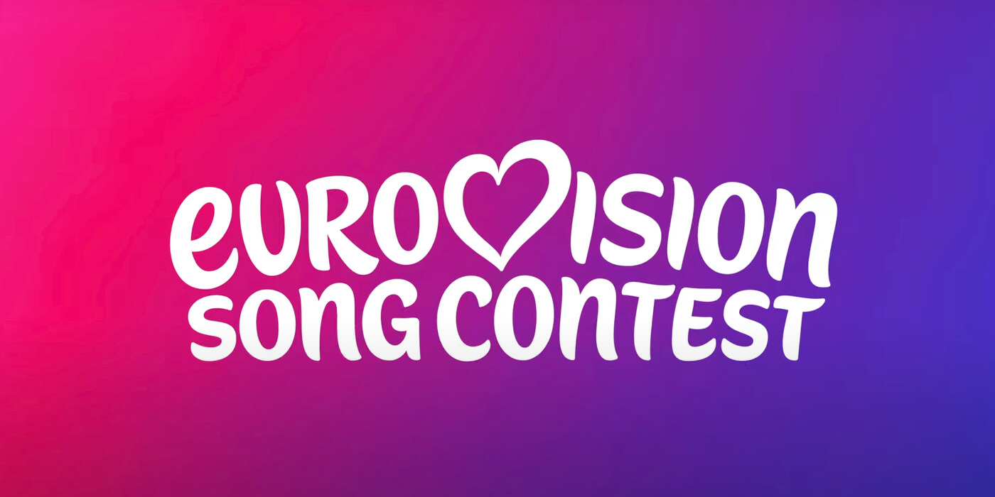
New Eurovision logo
For the first time since 2015, the EBU has redesigned the generic Eurovision logo. The new design will be used starting from the Eurovision Song Contest 2026 and in future contests
The European Broadcasting Union (EBU) today unveiled a freshly redesigned generic logo for the Eurovision Song Contest. This new visual identity marks the first update to the generic logo since its previous refresh in 2015.
Historically, each edition of Eurovision featured a unique logo created by the host broadcaster until 2004. That year, the EBU introduced a standardised heart logo where the “V” in “EUROVISION” was replaced by a heart containing the flag of the previous year’s winning country, ensuring consistency across all editions.
This generic logo served from 2004 to 2014, when it was replaced by a modernized version in 2015 to celebrate the 60th contest. The update, designed by Amsterdam-based Cityzen Agency, featured cleaner letter alignment, a more refined heart, and improved legibility at small sizes.


Now, a decade later, the EBU has introduced another evolution of the logo with a single, unique and familiar marquee element at its center: The Eurovision heart. It has a new custom-made font “Singing Sans” with a special lower "E" in the Eurovision Song Contest.
The Eurovision Song Contest’s brand refresh was created by the European Broadcasting Union (EBU) in collaboration with British branding studio PALS, who also worked on the brand strategy for Eurovision 2023 in Liverpool.
History of the generic Eurovision logo
1956 – 2003
Annual contest-specific logos, often featuring national symbols or themes depending on the host broadcaster.
2004 – 2014
Introduction of the standardised logo: a handwritten “Eurovision” wordmark with a heart, inserting the flag of the previous year’s winner.
2015 – 2025
Refreshed version for the 60th contest: cleaner lines, updated typeface, and enhanced clarity.
2026 –
From logo to lettering for the 70th contest: A new custom-made font “Singing Sans” with a special lower "E" in the Eurovision Song Contest.

Specifically for the 70th Eurovision Song Contest next year, the new generic logo has been included in the contest's artwork:
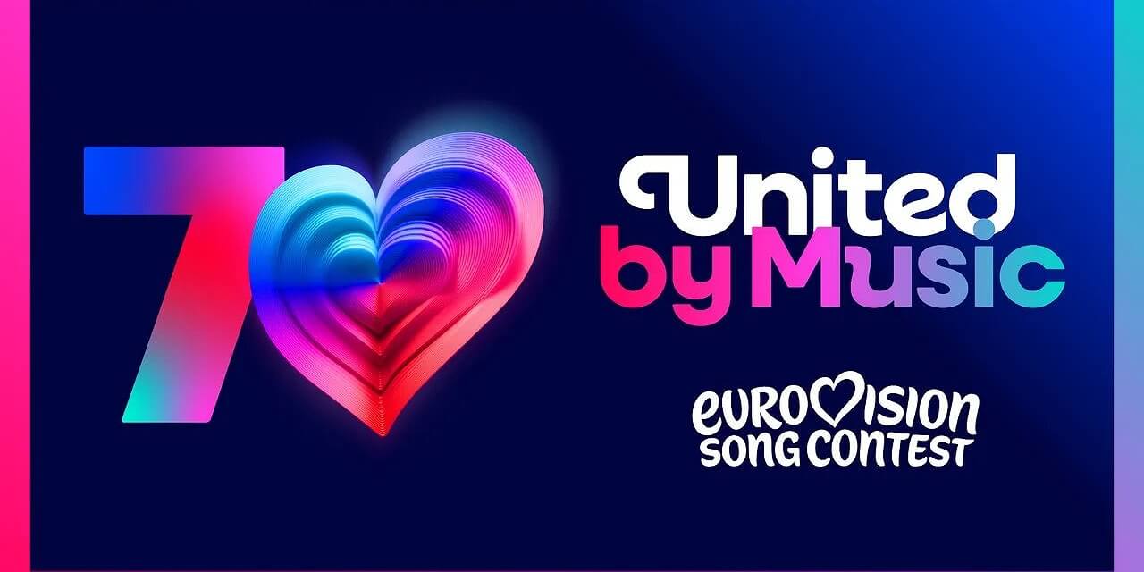
Martin Green CBE, Director of the Eurovision Song Contest, says:
– The Eurovision Song Contest has always been about evolution - musical, cultural, and creative. This refresh honors 70 amazing years while taking the brand forward to an exciting future. It’s bold, playful, and full of heart - just like the Contest itself. We’re so proud to unveil it to the world.
– Our new logo and look have been designed to make the ESC brand clearer on digital platforms, bring our family of projects all into one space, and protect the brand globally for EBU Members as the Contest continues to attract new audiences across the world.
– You’ll start to see more of our new brand identity as we head toward the Eurovision Song Contest 2026, and there’ll be more surprises and details on all the activities celebrating 70 years of being United by Music coming in the months ahead.


