EBU Logo
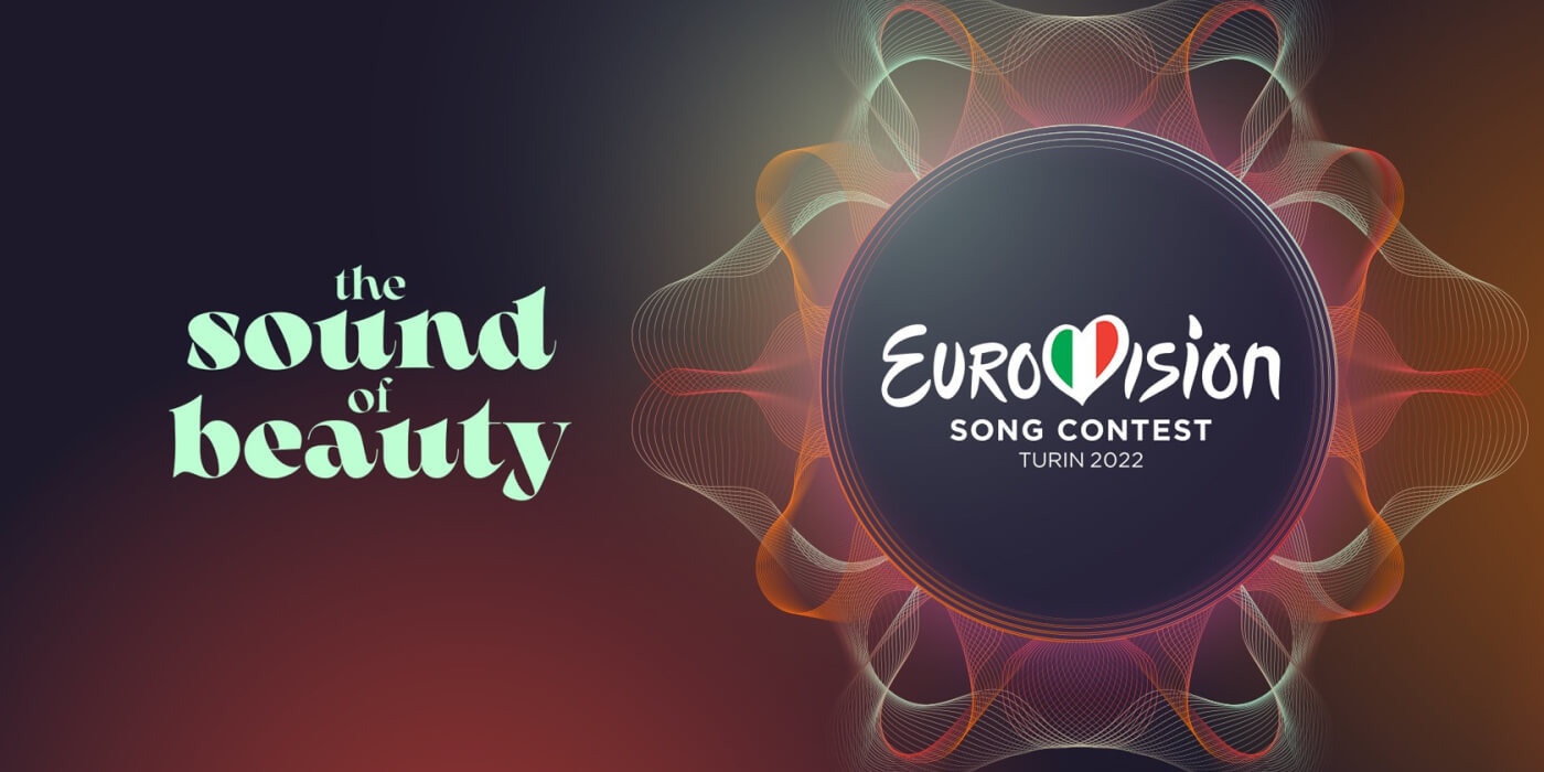
Recently, Radiotelevisione Italiana, commonly known as RAI, released this year’s logo and slogan for the Eurovision Song Contest which will be held in the city of Turin, Italy. This marks Italy’s first foray into introducing a slogan to accompany the logo as slogans were not introduced until 2002 when Estonia gave us ‘A Modern Fairytale’ and only their third time releasing a logo, but Italy’s relationship with the EBU logo goes farther back than the ESC itself.
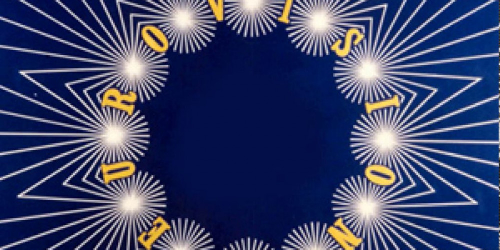
In 1954 the EBU adopted a new logo to use for all of it’s special broadcast events. Timothy O’Brien of the BBC presented them with the circular logo of 12 stars on a blue background fanning out in rays all around it. This logo was first used for the Eurovision Song Contest at it’s inaugural broadcast in 1956 but it was supposedly first used by the EBU in 1955 for the first televised edition of the Sanremo Music Festival although I could not find video to confirm this. For the ESC broadcasts the letters of the word ‘Eurovision’ were alternated between the stars of the logo and in the center were set the initials of the host broadcaster. This EBU logo remained constant until 1994 when the logo was updated to reflect the broadcast union’s eastward expansion. The circle of stars was retired and replaced with three stylized ‘V’s in a triangular configuration set over a gold ring.
2012 would bring about the next change in the EBU logo, but the ESC would have to wait until 2013 to use it. The logo we know today was first used to present the 2012 Junior Eurovision Song Contest which took place December 1, 2012. This logo remains today as the word Eurovision with the first ‘O’ surrounded by two semi-circles. This logo is used as the opening sequence for not only the Eurovision Song Contest but for all EBU special broadcasts.
Eurovision Logo
Since the beginning, each broadcaster presented the contest with it’s own title logo which would follow the EBU logo at the start of the broadcast. In the early years a simple text of the name of the contest was used although in 1963 the UK was the first to present the flags of the participating nations in it’s logo. In 1965, when Italy first hosted the contest, RAI simply used the Eurovision 12 stars logo with the name of the contest next to it. The logos naturally evolved with the times reflecting the changes in popular culture and technology.
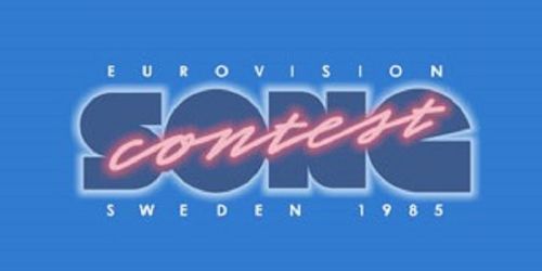
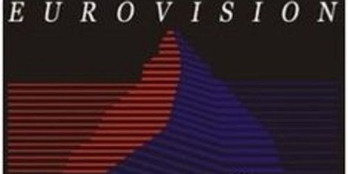
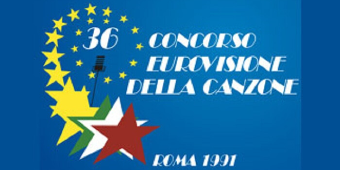
In 1985 Sweden used a very 80's style in writing ‘contest’ in the form of a neon light and in 1989 Lausanne, Switzerland gave us an artistic digital representation of the Matterhorn, which ironically is closer to Turin than it is to Lausanne. In 1991 when the contest was held in Rome, Italy, RAI chose again to use stars but in a different form. 21 gold stars, representing 21 nations, spiral outward from a microphone and end with three stars representing the flag of Italy, the 22nd on the list of participating nations that year.
The tradition of broadcasters creating their own logo continues today but with one small difference imposed by the EBU in order to create cohesion. In 2004, the same year semi-finals were introduced, the EBU introduced the first standardization of the Eurovision Song Contest logo. Starting with the ’04 edition in Istanbul, Turkey, ESC fans were shown the ‘Heart’ logo we all know today, where the center V is replaced with a heart shape in which the flag of the host nation is inserted. The heart logo would have two separate incarnations. The first was designed by JM international and featured a custom typography for the word Eurovision with ‘song contest’ written underneath in Microgramma. The logo was revamped for the 60th anniversary contest in 2015 by Storytegic and again used a custom but different typography and used Gotham Bold for the words ‘song contest’.

Slogans
Beginning in 2002 each nation began to present a slogan to accompany it’s logo when hosting. This began in Estonia as previously stated. The slogan typically receives more criticism than the logo. Some of these slogans have represented the core values of the ESC in promoting unity such as ‘Under the same sky’, ‘We are one’ and ‘Come together’, among others. Some other slogans represent the host nation itself such as 2005’s ‘Awakening’ following the changes which occurred in Ukraine earlier that year or in 2012 Baku, Azerbaijan chose ‘Light your fire’ as a representation of their nickname ‘Land of fire’.
Every year the logo and slogan are both met with criticism, so it should be no surprise that Italy has encountered the same when they released ‘The Sound of Beauty’ slogan alongside it's stylistic sound waves logo. The logo itself seems to have been accepted since the animations have been released and the large sponsor logo in the center has since been redone. The slogan, however, still seems to be struggling to win over the fan base en masse. Most anti’s cite the seemingly faulty translation or incorrect sentence structure. Despite these issues it seems that RAI will be staying with their slogan and logo as presented.
Why do these seemingly mundane items cause so much tension? Not only are they the visual representation of the contest itself but it is the first thing seen when viewing ESC news and updates. All that makes them something that fans are going to see a lot of. Personally, this year’s logo is the first I have really liked since Portugal gave us the slogan ‘All Aboard!’ with the conch shell logo.


